


2020–2022
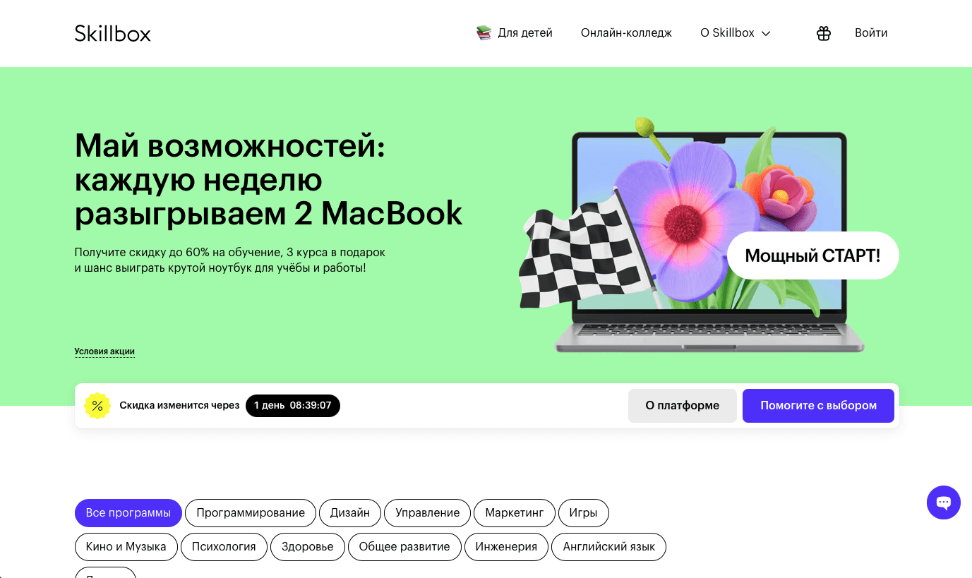
Skillbox is one of the largest EdTech platforms in Russia, offering online courses in design, programming, marketing, and more.
I worked as a Lead Product Designer and led the redesign of three core products: the student LMS, the teacher dashboard, and a new non-linear learning platform (LMS 3.0). Over the course of two years, I:
Launched two LMS platforms used by tens of thousands of students
Built and led a design team of 6–10 people
Set up hiring, onboarding, mentoring, and review processes
Established a scalable design system
Integrated a new learning strategy (SSDL + 4C/ID) into the product experience
Through better UX and interface design, we achieved key results:
CSAT improved from 34% to 82%
45% of students migrated to LMS 3.0 within months
Students submitted 2–2.5× more homework and portfolio cases
Fast link:
(01) LMS Redesign: simplifying learning & boosting motivation
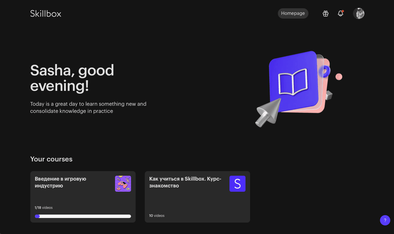
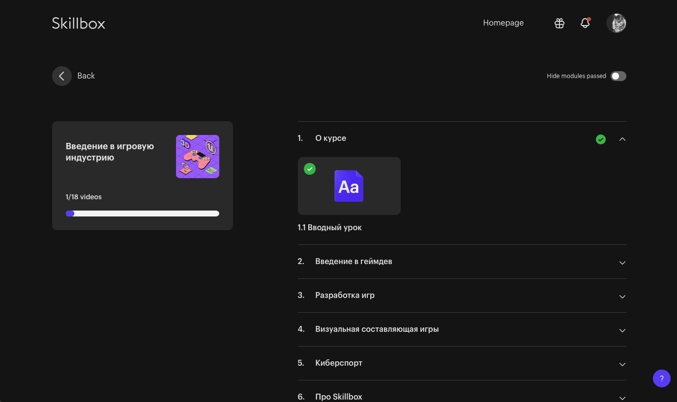
As part of my role at Skillbox, I led the full redesign of the student-facing LMS. The previous experience was outdated, overloaded with content, and disconnected from the modern, friendly tone of the Skillbox marketing site. It didn’t support personalization, was difficult to scale, and demotivated learners from continuing their journey.
Key problems we solved:
Outdated and visually inconsistent design
Low student motivation due to overwhelming content and a lack of structure
Poor alignment with business goals — students dropped out before completing courses
Lack of personalized learning experiences
No tools in the interface to build a habit or maintain momentum
Weak emotional connection with the platform
How we started:
We started by reviewing interviews with students and stakeholders to identify key problems in the LMS experience. Then we:
Defined key success metrics (CSAT, engagement, homework completion)
I created a set of design principles focused on simplicity, emotional tone, and consistency with the Skillbox brand
Used models like ARCS (motivation), SSDL, and SMART/OKR to align design with business and learning goals
Ran a one-week remote workshop with the design team to shape direction and define priorities
What we changed:
Simplified learning structure: streamlined course layout and navigation
Improved visual system: aligned with the marketing site for a seamless ecosystem
New onboarding: guided first steps, encouraging students to take action immediately
Friendly tone of voice: added human-centered language and personalized touches (e.g. name-based greetings)
Motivation mechanics: progress bars, milestone feedback, smaller achievable steps
Personalization engine foundation: groundwork for adaptive content and smart recommendations
Impact:
We measured impact through regular CSAT/NPS forms, surveys, and student interviews, combining quantitative feedback with live signals from real users
CSAT grew from 34% to 82%
Clear increase in completion of next lessons and submission of homework assignments
Higher engagement during the first sessions of learning
Students reported improved clarity and friendliness in the interface
And we saw better learning outcomes
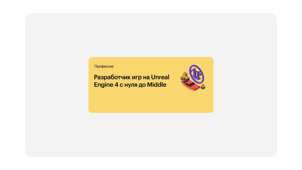
(02) LMS 3.0: non-linear learning experience
I led the product design of LMS 3.0, a new non-linear learning system built to give students more autonomy, flexibility, and motivation. Unlike the original LMS, which followed a fixed, linear path, this platform allowed learners to build custom learning journeys and focus on real-world, practice-based tasks.
What we built:
Non-linear learning structure based on SSDL (Self-Directed Learning) and the 4C/ID model
Students could choose tasks of different difficulty levels, skip, return, and build their own learning flow
A progress map showed overall advancement and gave structure without enforcing strict order
Introduced a point system that simulated freelance mechanics: students earned credits for completed tasks
Clear connection between learning and career goals — students could see how far they were from being “job ready”
Why we did it:
Designed the full UX and UI of the system
Translated learning theory into interactive components and flows
Worked closely with instructional designers and PMs to ensure pedagogical soundness
Defined key screens: task selection, progress map, level system, onboarding
Built design prototypes for user testing and iteration
Results:
45% of students were transitioned to LMS 3.0 within the first rollout
Students completed 2–2.5× more homework assignments (portfolio cases) compared to the old system
40% of students completed tasks across all difficulty levels
25+ courses were successfully migrated to the new format
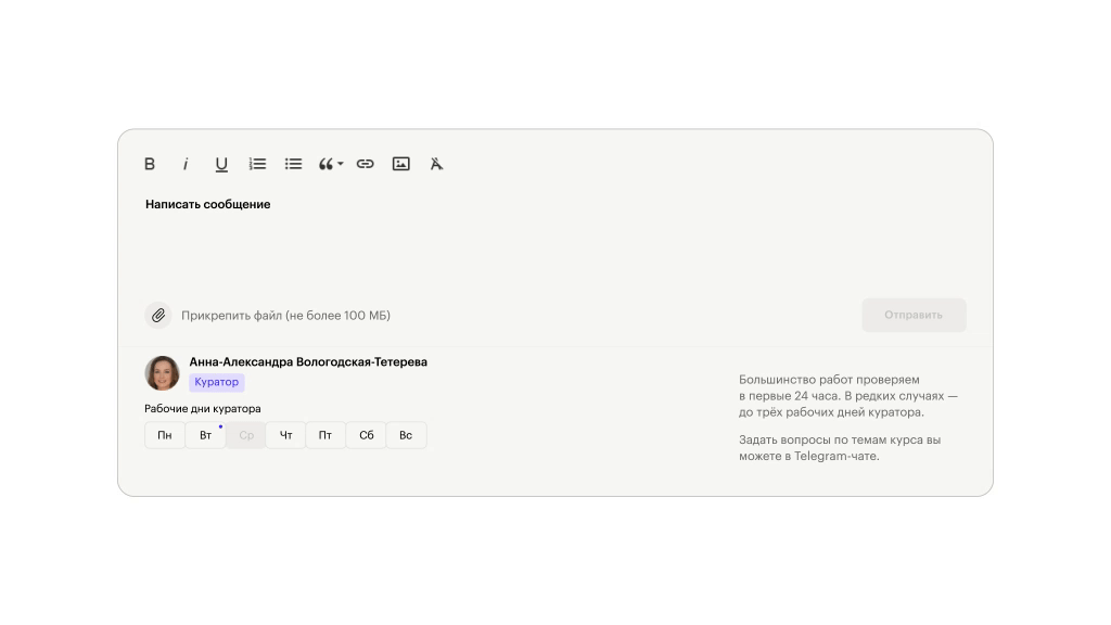
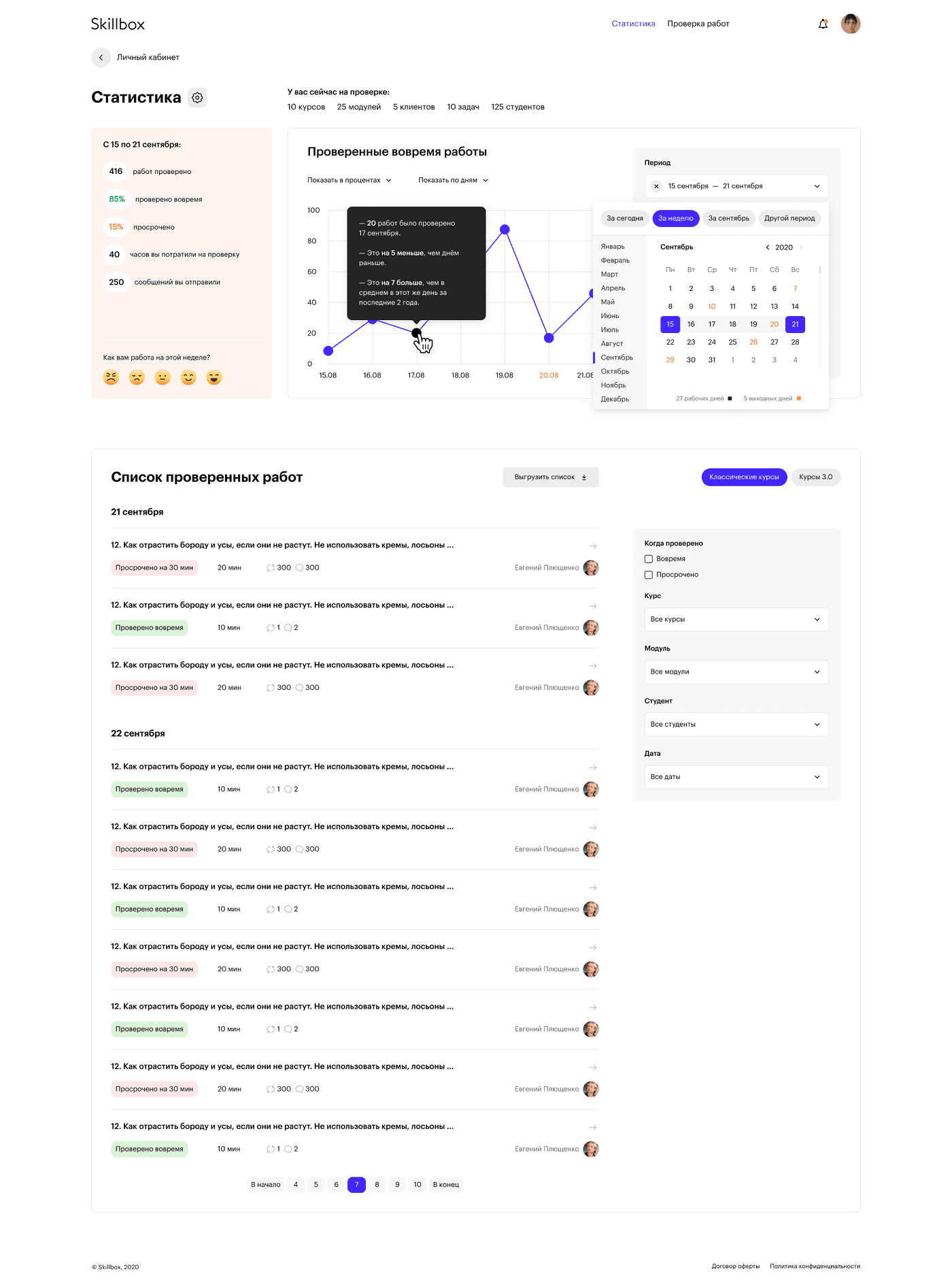
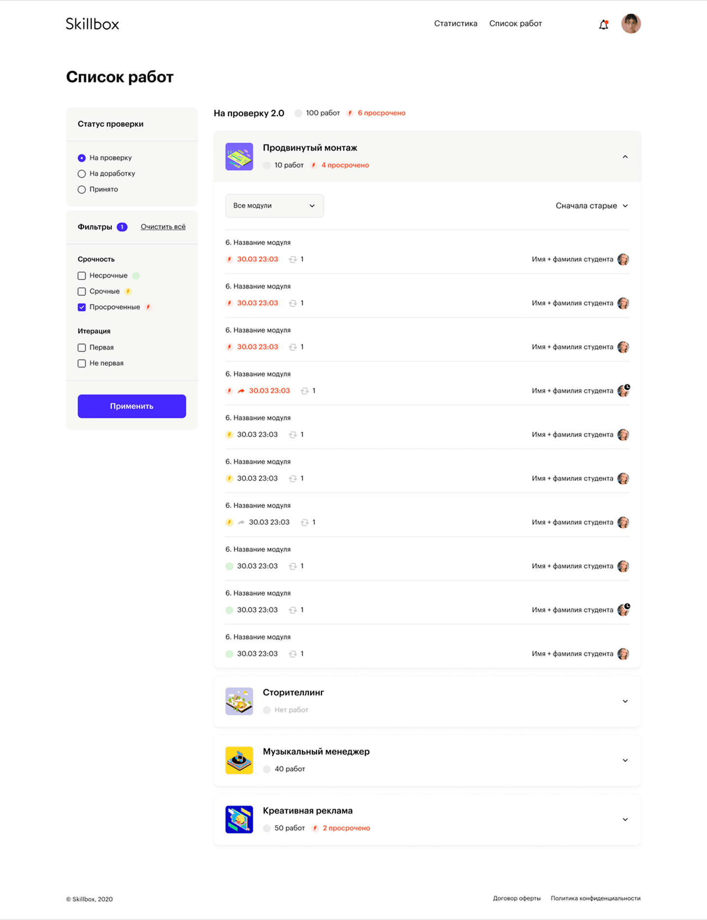
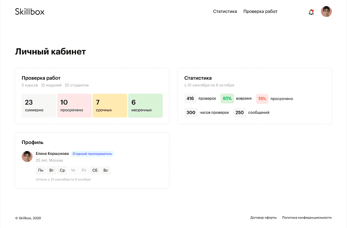
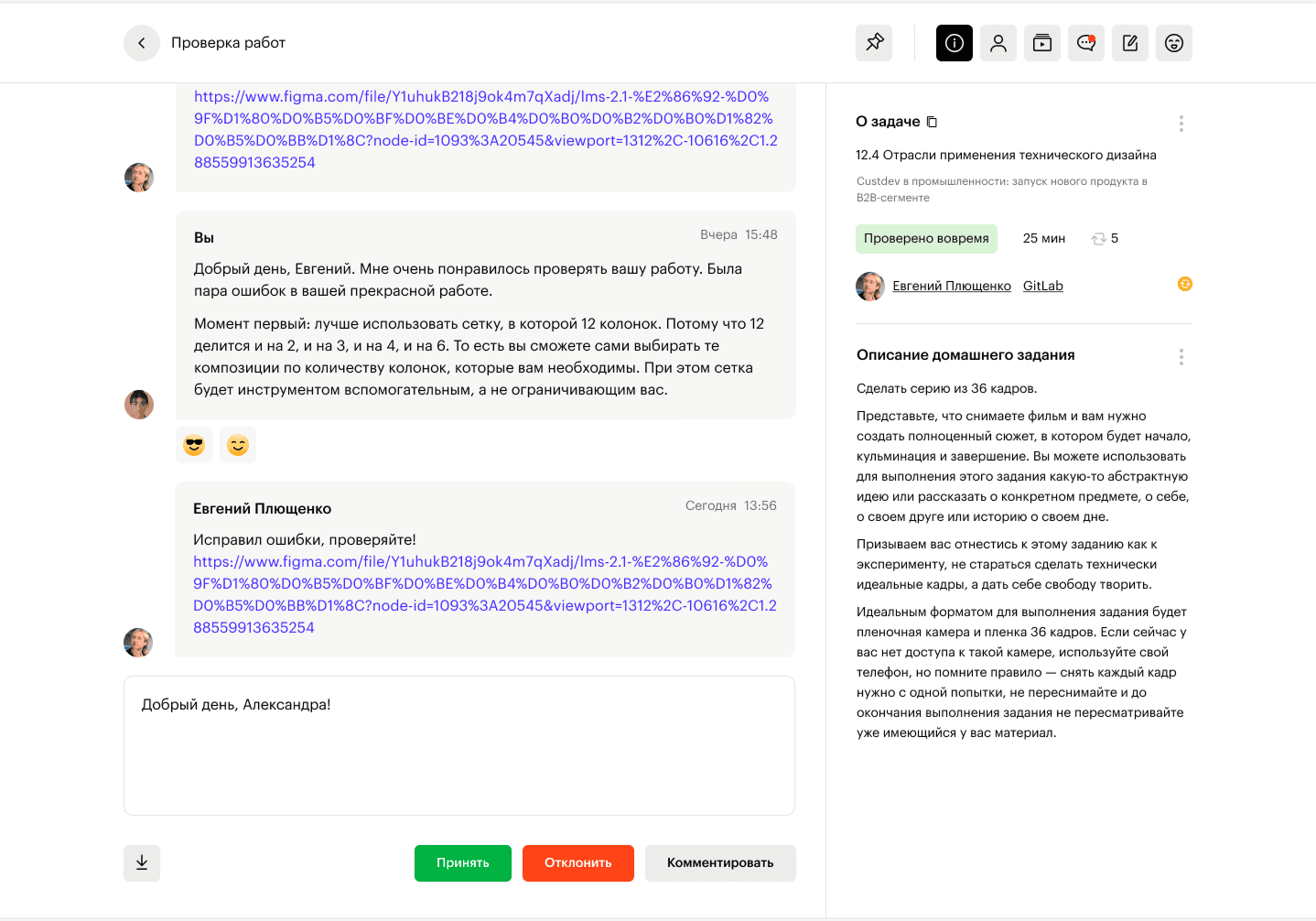
(03) Teacher Dashboard: homework review system
Alongside the student-facing LMS, I led the redesign of the internal platform used by over 2,000 active teachers to review assignments, manage progress, and communicate with students.
Challenges:
The interface was cluttered and hard to scale
Instructors had no prioritization, urgent assignments were often missed
Communication with students was scattered and time-consuming
No analytics or support for planning and performance tracking
What we changed:
Redesigned the homework review flow: clearer structure, simplified feedback, faster access to files
Added prioritization logic: flagged tasks approaching the 24h deadline and surfaced them first
Integrated contextual hints and quick actions: helped instructors act faster and more confidently
Introduced a personal dashboard: with data on task count, time spent, income, and student progress
Improved system communication tone to feel more supportive and less mechanical
What we did it:
Personally reviewed 10+ student assignments per day for several weeks to understand instructor pain points
Turned those insights into concrete design decisions
Designed the full UX/UI for the platform and synced it with the student-side experience
Worked closely with product, ops, and teaching teams to match workflows with actual instructor behavior
Results:
95% of assignment checks were completed within the first 24 hours
Significant drop in overdue reviews
Higher instructor satisfaction and platform clarity
Smoother workflows during peak activity periods
Stronger connection between teacher and student experiences
(04) Team Leadership & Design Culture
At Skillbox, I led design across three core product directions: the student LMS, the teacher dashboard, and the new non-linear LMS 3.0. Alongside hands-on product work, I focused on building a strong, independent, and thoughtful design team — not just in structure, but in mindset.
Team management & growth:
Managed a team of 6–10 product designers across product, marketing, and media
Ran full hiring cycles: interviews, onboarding, offboarding
Set up regular 1:1s, design reviews, and async feedback loops
Created a design skill map, a clear growth framework that helped each team member navigate their development path
All team members grew from mid to senior level. Interns became confident mid-level designers.
Focused on craft, product thinking, and communication, not just output
Process & delivery:
Co-created and scaled a shared design system, improving delivery speed by ~30%
Improved handoff with dev and QA, fewer bugs, faster launches
Worked closely with PMs to shape roadmaps and balance delivery and quality
Collaborated with heads of teaching, methodology, and product to align UX with business and educational goals
Design Culture & Principles:
Alongside team management, I shaped how we worked as a design team, setting principles that supported ownership, speed, and clarity.
Promoted radical inclusion: everyone was responsible for product quality; design reviews were open and focused on goals, not seniority
Reframed tasks as design artifacts: clearly scoped, easy to pick up, always linked to broader context and deadlines
Protected creative space: briefs left room to question and explore, not just execute
Set high standards for clean handoff: structured files, early developer involvement, fewer surprises at delivery
These principles helped the team move fast, collaborate better, and take real ownership of their work.
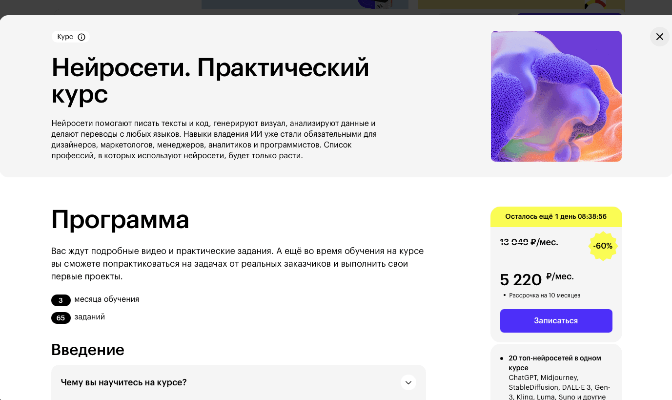
(05) One more: Conversion Boost
In addition to core LMS work, I led the redesign of a key promotional landing page used during major sales campaigns. The original page was overloaded and unclear, leading to low engagement and missed opportunities.
Goal:
Improve browse-to-purchase conversion rate during seasonal promotions
Problem:
Lack of clarity in pricing, bonus mechanics, and deadlines
Mobile experience was weak and cluttered
Low confidence and urgency for the user
What I changed:
Reworked structure and content hierarchy for better focus
Added testimonials and a visual breakdown of what’s included
Highlighted the main value of the deal in the first screen
Simplified mobile layout and key CTAs
Result:
+13% CR increase during campaign period
Additional ₽11M (~$150K) in monthly revenue from improved conversion
Better scroll depth, more confident user actions, and positive feedback from the marketing team
(06) Final thoughts or what I learned at Skillbox
Beyond metrics and features, working at Skillbox helped me grow as a product designer and team lead. Here’s what I took with me:
A wide audience isn’t a problem, it’s a playground:
At first, the scale and variety of users felt like a constraint. But I learned that broad audiences unlock more space for creativity, hypotheses, and product thinking. The key is in prioritization.
The hardest part is communicating why:
Aligning people around the problem, not just the solution, is often the real work. Explaining why we’re doing something, again and again, is what makes vision stick and decisions sustainable.
Clarity beats complexity:
Whether in interface design or team communication, clarity always wins. Especially in high-stakes, multi-role environments.
Design is part of strategy, not decoration:
I stopped seeing design as the last step. I learned to use it to shape problem definitions, business thinking, and customer experience across the entire journey.
The team is everything:
Systems and strategies mean little without the people to carry them. Leading a team taught me to care deeply about energy, trust, and shared ownership. Growth happens when people feel safe to think, challenge, and build together.
Big thanks to the entire team I worked with, and to everyone who gave me the trust and space to do all this. It wouldn’t have been possible without you.